




 Get to WhatsApp

Our manager will contact you
within 15 minutesт
Why Your Website Gets Traffic But No Calls, Leads or Sales — Expert Tips to Fix It
When Visibility Is Not the Problem — Conversion Is
OUR SEO SPECIALISTS, MARKETERS, AND WEB DESIGNERS HAVE SPENT YEARS BUILDING AND PROMOTING WEBSITES SPECIFICALLY DESIGNED TO GENERATE REVENUE — NOT JUST RANKINGS. WE WROTE THIS GUIDE BECAUSE WE SEE THE SAME PAINFUL PATTERN REPEATEDLY: BUSINESSES INVESTING IN TRAFFIC GROWTH WHILE THE FUNDAMENTAL REASONS VISITORS DON’T CONVERT GO COMPLETELY UNADDRESSED. THIS IS OUR HONEST BREAKDOWN OF WHAT’S ACTUALLY GOING WRONG AND WHAT TO DO ABOUT IT.

Why Your Website Gets Traffic But No Calls, Leads or Sales — Expert Tips to Fix It
What You Will Learn in This Guide
1. The Real Problem Nobody Wants to Hear About
2. Design, First Impressions, and the Trust Threshold
3. Message Mismatch: When the Wrong People Arrive
4. The Conversion Killers Hiding in Plain Sight
5. Calls to Action That Actually Work
6. Speed, Mobile Experience, and the Patience Problem
7. How to Diagnose What Is Actually Broken on Your Site
8. Closing the Gap Between Traffic and Revenue
9. FAQ
The Real Problem Nobody Wants to Hear About
There’s a conversation that happens in almost every digital marketing engagement at some point, and it’s an uncomfortable one. The client has been investing in search visibility, traffic is growing, the rankings are improving — and then someone pulls up the conversion data and the room goes quiet. Visitors are arriving. Visitors are leaving. Nothing in between is happening.
The instinct in that moment is usually to look for a traffic explanation. Maybe it’s the wrong keywords. Maybe the audience is wrong. Maybe the campaign is targeting too broad. These explanations are sometimes correct — but more often, the traffic is perfectly fine and the problem lives entirely on the website itself. Getting people through the door is not the same as getting them to stay, engage, and take action. Those are different disciplines, and conflating them is one of the most expensive mistakes a business can make in digital marketing.
The honest truth is that most websites are built to exist rather than to perform. They’re designed to look professional, to satisfy a stakeholder review process, to check a box that says “we have a website now.” The question of whether a visitor who lands on the homepage at 9pm on a Tuesday, with a specific need and a limited attention span, will take a meaningful action — that question is rarely the organizing principle of the build. And it shows in the numbers.
Understanding this reframe is the starting point of fixing the problem. If your site is getting traffic and not generating business, you don’t have a traffic problem. You have a persuasion problem. You have a clarity problem. You may have a trust problem. The good news is that all of these are solvable — but only if you stop trying to solve them with more traffic and start addressing what’s actually happening on the pages visitors are already seeing.
📌 The Conversion Reality Check:
Industry benchmarks suggest that average website conversion rates across most service and product categories sit between 2% and 5%. Many sites perform below 1%. If your site converts at 1% and you double your traffic, you still convert at 1% — you’ve just spent more money to get the same proportional result. Fixing conversion first multiplies the value of every visitor you already have, including the ones you’ve been paying to attract.
Design, First Impressions, and the Trust Threshold
Humans make visual judgments faster than conscious thought can intervene. Research on first impressions in digital environments consistently shows that users form an opinion about a website’s credibility within fractions of a second of landing on it — before they’ve read a single word. That opinion determines whether they lean in or look for the back button. Design is not decoration. It’s the first sales conversation your business has with every visitor, and it happens entirely without words.
What generates trust visually is not glamour or complexity — it’s coherence, professionalism, and clarity of purpose. A site that looks consistent, loads cleanly, uses professional photography rather than stock images, maintains a logical visual hierarchy, and immediately communicates what the business does and who it serves — that site passes the trust threshold. A site that looks dated, loads inconsistently, crowds the page with competing elements, or uses visual styling that feels mismatched with the apparent price point of the service — that site fails the test before a visitor has consciously evaluated anything.
The price point dimension is worth spending time on. There’s a visual expectation associated with any service or product at any price level. A premium law firm, a luxury property developer, a high-end cosmetic practice — the visual design of their website needs to reflect the standard of service they claim to deliver. When the design doesn’t match the positioning, visitors experience a subconscious dissonance that raises doubt. If the website looks like it cost $500 to build and the service costs $10,000 to buy, many visitors will quietly assume the service quality reflects the website quality — and leave without ever articulating why.
- ▶ Professional photography over stock imagery — real people, real environments, real products
- ▶ Consistent visual language — typography, color palette, and spacing that feel intentional
- ▶ Clear visual hierarchy — the eye should move naturally from headline to value proposition to action
- ▶ Social proof positioned above the fold — reviews, logos, certifications, case study snippets
- ▶ Visual consistency across all devices — a site that degrades on mobile destroys the impression built on desktop
Social proof deserves its own paragraph because it’s so consistently underutilized. Reviews, testimonials, case studies, client logos, media mentions, professional certifications — these are not nice-to-have additions to a website. For many categories of business, they are the primary conversion driver. A visitor who arrives uncertain can be converted by seeing that fifty other people with similar needs were satisfied. A visitor who arrives ready to engage can be stopped from converting by the absence of any validation that the business delivers on its claims.
Ad Message Mismatch: When the Wrong People Arrive
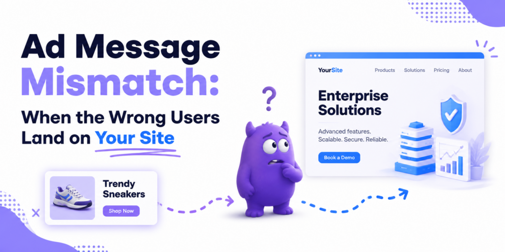
Ad Message Mismatch: When the Wrong People Arrive
Not all traffic problems are conversion problems. Sometimes the visitors arriving are genuinely not the right audience, and that’s an important distinction to make before investing heavily in website optimization. If the keywords driving your traffic are informational rather than commercial — people looking for answers rather than services — no amount of conversion rate optimization will turn them into paying customers, because they were never in buying mode to begin with.
The diagnostic here starts with intent analysis. Pull your top organic search queries from Search Console and classify each one honestly: is the person who typed this query likely to be looking for a business like yours, or are they looking for information, education, or a free solution? A plumber who ranks for “how to fix a leaking pipe yourself” is attracting an audience actively trying not to hire a plumber. That traffic is not convertible in any meaningful volume regardless of how good the website is.
The flip side of this is equally important. When the right visitor arrives — someone with genuine intent to hire, buy, or engage — and they still don’t convert, the problem is definitely on the website. This is where message alignment becomes critical. The language a visitor used in their search query should feel reflected in the language they see on the page they land on. If someone searches for “emergency roof repair contractor” and lands on a page that talks about “comprehensive roofing solutions for residential and commercial properties,” there’s a gap between their urgent, specific need and the generic language greeting them. That gap costs conversions.
Understanding how to attract the right visitors in the first place — and how to ensure your organic presence is built around commercial intent — is covered in depth in the local SEO guide, which addresses how to align visibility with audience intent at the query level rather than just driving traffic volume.
The Conversion Killers Hiding in Plain Sight
Once you’ve confirmed that the right visitors are arriving and the design is passing the trust threshold, the next layer of analysis is about the specific elements on the page that are either facilitating or blocking the decision to act. These are the conversion killers — and they’re almost always hiding in plain sight, overlooked precisely because they seem mundane compared to the bigger-picture strategic questions.
Contact friction is one of the most consistent offenders. If the path to contacting your business requires more than two or three steps, you’re losing a significant percentage of people who were willing to reach out but lost patience with the process. A contact form with twelve fields. A phone number buried in the footer. An enquiry process that requires account creation before submission. A chat widget that takes thirty seconds to load. Every additional step between “I’m interested” and “I’ve made contact” creates an opportunity for the visitor to reconsider, get distracted, or simply give up.
Pricing ambiguity is another major friction point that businesses consistently underestimate. Many service businesses avoid displaying pricing on their website because they think it will deter prospects before they’ve had a chance to demonstrate value. The effect is often the opposite. When a visitor can’t find any pricing information — not even a range or a starting point — they face uncertainty. Uncertainty is uncomfortable, and the most common response to discomfort is to leave and look somewhere that feels less opaque. You don’t need to list every price point; you need to give enough information to make the visitor feel they’re dealing with a business that’s transparent about how it operates.
Unclear value proposition is perhaps the deepest conversion killer because it operates at the level of fundamental comprehension. If a visitor can’t immediately answer the question “why should I choose this business over the alternatives?” — the case for contacting you hasn’t been made. Many websites describe what they do in technical terms, or list services as features, without ever articulating the benefit to the customer. “We provide comprehensive digital marketing solutions” says nothing meaningful. “We help professional service firms generate consistent enquiries from organic search without paying for ads” says something specific, differentiating, and benefit-oriented.
👉 The Seven-Second Rule:
Studies on web user behavior suggest that visitors decide within seven seconds whether a page warrants further attention. In that window, they’re not reading — they’re scanning. The headline, the hero image, the primary call to action, and the immediate social proof signals are all they process in those first moments. If none of those elements clearly communicates why they should stay, they won’t. Design and copy strategy need to work together with that window in mind.
The complete picture of what drives visitors to take action — and what the most effective lead generation mechanics actually look like in practice — is covered in detail in the guide on how to generate leads from your website, which goes beyond conversion theory into specific, implementable tactics.
Below is a comprehensive reference for the most impactful conversion improvements across the most common problem areas. The table is designed to give you both the diagnosis and the direction of the fix, so you can prioritize based on where the gaps are largest on your own site.
| Conversion Problem | What It Looks Like | What to Fix |
|---|---|---|
| No clear value proposition | Generic headline that could apply to any competitor | Rewrite headline around the specific outcome you deliver |
| Buried contact options | Phone number only in footer, no inline CTAs | Add phone, form, and chat access above the fold and after every section |
| No social proof above the fold | Reviews and testimonials only at the bottom of the page | Add star rating, review count, or client logos near the top of the page |
| Overloaded contact forms | Forms requesting 8+ fields before first contact | Reduce to name, email, and one qualifying question maximum |
| Pricing opacity | No indication of cost range anywhere on the site | Add a “starting from” price or a transparent pricing page |
| Weak or generic CTAs | “Submit” or “Click here” as button text | Use action-oriented, benefit-specific language: “Get My Free Consultation” |
| No urgency or reason to act now | Static pages with no time-sensitive element | Add limited availability messaging, response time guarantees, or timely offers |
| Poor mobile experience | Desktop-first layout that breaks on phone screens | Redesign for mobile-first with thumb-accessible CTAs and simplified navigation |
| Slow load time | Pages taking more than 3 seconds to become interactive | Compress images, eliminate render-blocking scripts, use a CDN |
| No follow-up mechanism | Visitors who don’t convert on first visit are lost forever | Implement email capture with a genuine incentive, retargeting pixels |
| Unclear service scope | Visitors unsure if you serve their area, industry, or need | Add explicit geographic and industry scope to key pages and headings |
| No trust signals for new visitors | No certifications, memberships, or verifiable credentials visible | Display association logos, accreditations, and media mentions prominently |
| Content mismatch with visitor intent | Commercial visitors landing on informational content | Create dedicated service pages aligned to commercial search queries |
| No live chat or instant contact option | Visitors with quick questions have no low-friction way to ask them | Add a lightweight chat widget or WhatsApp button with a fast response promise |
Calls to Action That Actually Work
The call to action is the moment where a website either completes its job or fails it. Everything else on the page — the design, the copy, the social proof, the navigation — exists to bring the visitor to a point of readiness. The call to action is the bridge between readiness and contact. And yet most calls to action are treated as an afterthought: a button added at the end of a page with whatever text the developer typed first.
Effective calls to action share a set of characteristics that distinguish them from the generic versions most websites use. They are specific about what happens next — “Book a Free 20-Minute Strategy Call” is more effective than “Get In Touch” because it removes uncertainty about what the visitor is committing to. They are benefit-oriented — the focus is on what the visitor gets, not what the business wants them to do. They are visually prominent without being aggressive — they stand out from the surrounding content through contrast and placement rather than through size alone.
Placement matters as much as language. A single call to action at the bottom of a long page reaches only the visitors who read to the end. Strategic placement — at the top of the page before any scrolling, after each major value-building section, and at the bottom — ensures that a visitor who reaches readiness at any point in their journey has an immediate, obvious path to taking action. Many websites have one CTA and wonder why their conversion rate is low. The answer is that most visitors never get to it.
The number and variety of contact options also plays a role. Some visitors prefer to call. Some prefer to fill in a form. Some will use a chat widget but would never pick up the phone. Offering multiple contact mechanisms — and making all of them clearly visible — increases the probability that whatever the visitor’s preferred mode of communication is, they can use it immediately. Restricting contact to a single channel is an arbitrary friction that costs conversions for no benefit to the business.
Speed, Mobile Experience, and the Patience Problem
This section is about physics as much as it is about marketing. The patience of a website visitor is a finite and rapidly depleting resource. Research on load time and user behavior consistently finds that conversion rates decline measurably for every additional second a page takes to become usable. The relationship is not linear — the drop from one second to three seconds is dramatically more impactful than the drop from five seconds to seven. The first few seconds of perceived responsiveness are where the majority of impatient visitors decide to leave.
Mobile performance deserves particular attention because it’s both more consequential and more commonly neglected than desktop performance. The majority of web traffic now originates from mobile devices, and mobile users tend to be in contexts — commuting, between meetings, in waiting rooms — where patience is especially short and distractions are especially numerous. A site that performs well on desktop but loads slowly or displays poorly on a phone is failing the majority of its visitors by the numbers, regardless of how good it looks in a browser.
Mobile experience goes beyond load time. It encompasses the entire interaction model: whether buttons are thumb-accessible, whether text is readable without zooming, whether forms are usable on a small keyboard, whether the navigation makes sense in portrait orientation, whether phone numbers are click-to-call. A mobile visitor who has to zoom in to read your service description, pinch to expand a form, or manually dial a number that isn’t linked — each of these micro-frictions contributes to an experience that feels effortful rather than easy, and effortful experiences produce fewer conversions.
How to Diagnose What Is Actually Broken on Your Site
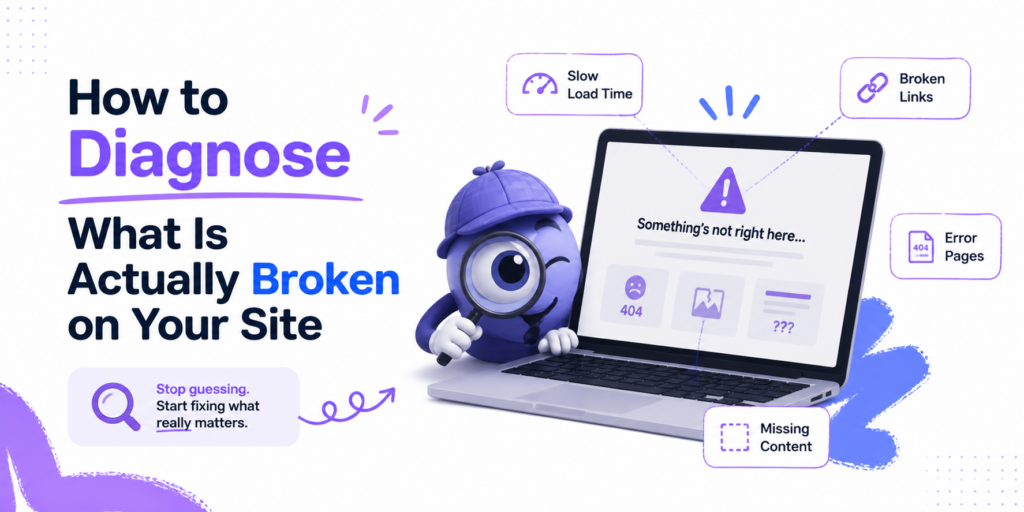
How to Diagnose What Is Actually Broken on Your Site
The most valuable thing you can do before spending money fixing your website is to understand specifically what’s wrong. “The site isn’t converting” is a symptom, not a diagnosis. The tools to identify the actual problem are widely available, and using them systematically produces a much more efficient improvement path than guessing at solutions.
Google Analytics is the starting point. The data you want to look at first is not overall traffic — it’s the behavior flow of users who arrive from organic search specifically. Where do they land? Where do they go next? Where do they exit? A page with a high exit rate and short time-on-page is telling you something specific: visitors are arriving, not finding what they expected, and leaving. A page with high time-on-page but low conversion tells a different story: visitors are engaged but not compelled to act — which points to a CTA or value proposition problem rather than a relevance problem.
- ▶ Use Google Analytics to identify high-exit pages and analyze what’s on them
- ▶ Use Search Console to understand which queries are driving traffic and whether they’re commercial
- ▶ Use heatmap tools like Hotjar or Microsoft Clarity to see where users click and how far they scroll
- ▶ Use PageSpeed Insights to get a concrete speed and Core Web Vitals assessment for both mobile and desktop
- ▶ Use session recording to watch actual visitor journeys — what real users do is often very different from what you’d expect
- ▶ Ask five people who don’t know your business to spend two minutes on your homepage and describe what you do — if they can’t, your messaging needs work
Heatmap and session recording tools deserve special mention because they reveal something analytics alone cannot: the human experience of using your site. Watching a recording of a real visitor struggling to find your phone number, scrolling past your CTA without registering it, or clicking on an element that isn’t a link because they expected it to be — these observations produce insights that no amount of aggregate data analysis can replicate. If you haven’t used session recording tools on your own site, start there before making any other changes.
🔎 The User Test That Changes Everything:
Ask someone unfamiliar with your business to sit in front of your homepage and think out loud as they try to find out what you do, who you serve, and how to contact you. Watch without intervening. The places where they hesitate, misclick, or express confusion are your highest-priority fixes. This ten-minute exercise consistently produces more actionable insights than hours of analytics review — because it shows you the experience rather than the data about the experience.
Your business listing in local search results is also part of the conversion picture — particularly for service-area businesses where a significant portion of commercial intent traffic arrives through map results rather than organic links. A poorly optimized local presence means potential customers who found you in search never make it to your website at all. The full picture of what Google Business Profile optimization involves — and how it affects both visibility and conversion for local businesses — is worth reviewing as part of a complete diagnosis.
Closing the Gap Between Traffic and Revenue
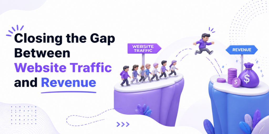
Closing the Gap Between Traffic and Revenue
By this point in the guide, you have a clearer picture of where the problem likely lives: in the design and first impression, in the message and its alignment with visitor intent, in the specific conversion elements on the page, or in the technical performance that affects whether visitors even get to see your content. The next step is prioritizing fixes in the right order.
The most common mistake in website optimization is starting with the most visible changes rather than the most impactful ones. Redesigning the homepage hero section looks meaningful and produces something new to show stakeholders. But if the real problem is that your contact form has too many fields, or your phone number isn’t click-to-call on mobile, or your core value proposition is unclear — the hero redesign doesn’t fix any of that. Start with the highest-friction points in the conversion path, not with the most aesthetically obvious ones.
💡 The relationship between your organic search presence and your conversion rate is also worth addressing directly. Better rankings bring more visitors — but more visitors amplify whatever your current conversion rate is. If you’re converting at 1%, more traffic means more people converting at 1%. If you fix your conversion rate to 4% first, every improvement in organic visibility produces four times the business impact. The sequence matters: optimize for conversion, then invest heavily in visibility growth.
For businesses wondering whether their traffic problems have an organic search component — whether the visitors arriving are low-quality because the search visibility itself is poorly configured — the guide on how to get more online customers without paying for ads addresses the organic acquisition side of this equation, including how to attract visitors who are more likely to convert rather than just more visitors in aggregate.
Link building — acquiring quality editorial links from relevant external sites — is the component of organic search that most directly influences whether your site is trusted enough by search engines to rank for commercial, high-intent queries. Understanding what link building actually involves and why it matters is part of connecting your conversion optimization work to the traffic acquisition strategy that feeds it.
The investment question is one that comes up in this context as well. Optimizing for conversion may require design work, copywriting, technical development, and ongoing testing — all of which have associated costs. Understanding what SEO and website optimization realistically cost helps calibrate expectations and prioritize budget in a way that produces the best return across both the traffic and conversion dimensions of the problem.
When you’re ready to engage professional support — whether for conversion optimization, organic search, or both — the guide on how to choose an SEO agency covers the specific criteria that distinguish partners who will actually move your metrics from those who will simply maintain a retainer. And if you want to understand what accountability-driven engagements with defined performance commitments look like in practice, the overview of guaranteed SEO services provides a useful framework for evaluating what’s actually on offer.
Finally, patience calibrated to reality is an underrated part of closing the traffic-to-revenue gap. The timeline for organic search to reflect conversion optimization work, and for optimization work to compound into sustained business growth, is measured in months — not days. Understanding how long search improvements take to show measurable results prevents the common mistake of abandoning a strategy that was working just before it was about to pay off.
Frequently Asked Questions — Straight Answers to Hard Questions
👉 My bounce rate is over 80%. Does that mean my site is broken?
Not necessarily — but it’s a signal worth investigating. Bounce rate measures single-page sessions, which can be legitimate (a user found your phone number and called) or problematic (a user found the page irrelevant and left immediately). The metric becomes meaningful when combined with average session duration. An 80% bounce rate with an average time on page of 30 seconds is very different from an 80% bounce rate with an average time of 3 minutes. Segment by traffic source and landing page to understand which bounces represent failure versus completion.
🔍 We get compliments on how beautiful our website looks. Why isn’t it converting?
Because beautiful and effective are not the same thing. A website can win design awards and fail to generate a single lead. Conversion performance depends on clarity of message, speed of loading, accessibility of contact options, and the quality of the persuasion journey — not on aesthetic appeal. In fact, some of the highest-converting websites in existence look relatively plain by design award standards. The question to ask is not “does this look good?” but “does a visitor who knows nothing about us immediately understand what we do, why we’re the right choice, and how to contact us?”
If the answer to that question requires any hesitation, the design work isn’t done — regardless of how it looks.
⚠️ We’ve been getting traffic for two years with no leads. Is the site fixable or should we start over?
The answer depends on the depth of the underlying problems. In most cases, targeted conversion optimization — addressing the specific friction points, restructuring CTAs, improving messaging clarity, fixing mobile experience — produces better ROI than a complete rebuild. A rebuild is appropriate when the site’s technical foundation is genuinely incompatible with modern performance standards, or when the brand positioning has fundamentally changed and the existing design can’t reflect the new direction. Otherwise, strategic optimization of what exists is usually faster and cheaper than starting fresh.
💰 How much should we invest in conversion optimization versus traffic growth?
A useful starting heuristic: if your current conversion rate is below 2%, prioritize conversion optimization before increasing traffic investment. Doubling traffic to a 1% converting site produces half the result of doubling the conversion rate to 2% on your current traffic. Once conversion is functioning — visitors are becoming leads at a reasonable rate — then traffic growth multiplies that performance. The most efficient sequence is usually conversion first, then traffic scale.
📌 Our competitors’ sites look worse than ours. Why do they get more business?
Visual quality is only one conversion variable, and often not the dominant one. Competitors with less visually impressive sites may be winning on review volume, on clarity of offer, on speed of response to enquiries, on pricing transparency, on local search presence, or simply on the strength of their reputation and word-of-mouth. Evaluate competitor sites not for aesthetics but for conversion mechanics: how easy is it to contact them, how much social proof is visible, how clearly do they articulate what they do and who they serve. Those are the dimensions worth benchmarking against.
🔹 We added a popup with a discount offer and conversions went down. Why?
Popups interrupt the engagement process rather than facilitating it. A visitor who arrived with genuine purchase intent and is immediately confronted with a discount popup before they’ve even evaluated the offer experiences cognitive disruption — and may actually leave rather than engage with the popup. Worse, an early discount offer can signal to a visitor that the standard price is negotiable, which undermines perceived value. Conversion tools work best when they engage visitors who are already showing intent signals — time on page, scroll depth, exit intent — rather than interrupting the discovery process before it begins.
📈 Is there a minimum conversion rate we should be targeting?
Industry averages for service businesses typically fall between 2% and 5% for organic search traffic. E-commerce conversion rates tend to be lower — often 1% to 3% — because the consideration process is different. These are averages, not targets. The most useful benchmark is your own historical performance compared to itself over time. A site that converted at 1.2% and now converts at 2.4% has doubled its return on every marketing investment without spending more on traffic. That improvement matters more than whether you’ve hit an industry average.
⚙️ We’ve tried everything and nothing works. Could the problem be the product or service itself?
Yes — and this is a question most digital marketing discussions avoid because it’s uncomfortable. If visitors are arriving with genuine intent, the website is well-designed and clearly communicates the offer, the conversion mechanics are sound, and people still aren’t contacting you — the feedback may be about the offer itself.
Price positioning relative to perceived value, service scope relative to market expectations, or reputation signals that aren’t strong enough to generate trust — any of these can produce conversion failure that no website optimization will fix. The honest diagnostic step is to talk directly to people who visited the site but didn’t contact you. The answers are usually very specific and very actionable.